Color Palettes: Check Contrast Before the UI Ships
Build palettes that hold up in real interfaces by checking contrast, states, tokens, and light/dark backgrounds before CSS changes ship.
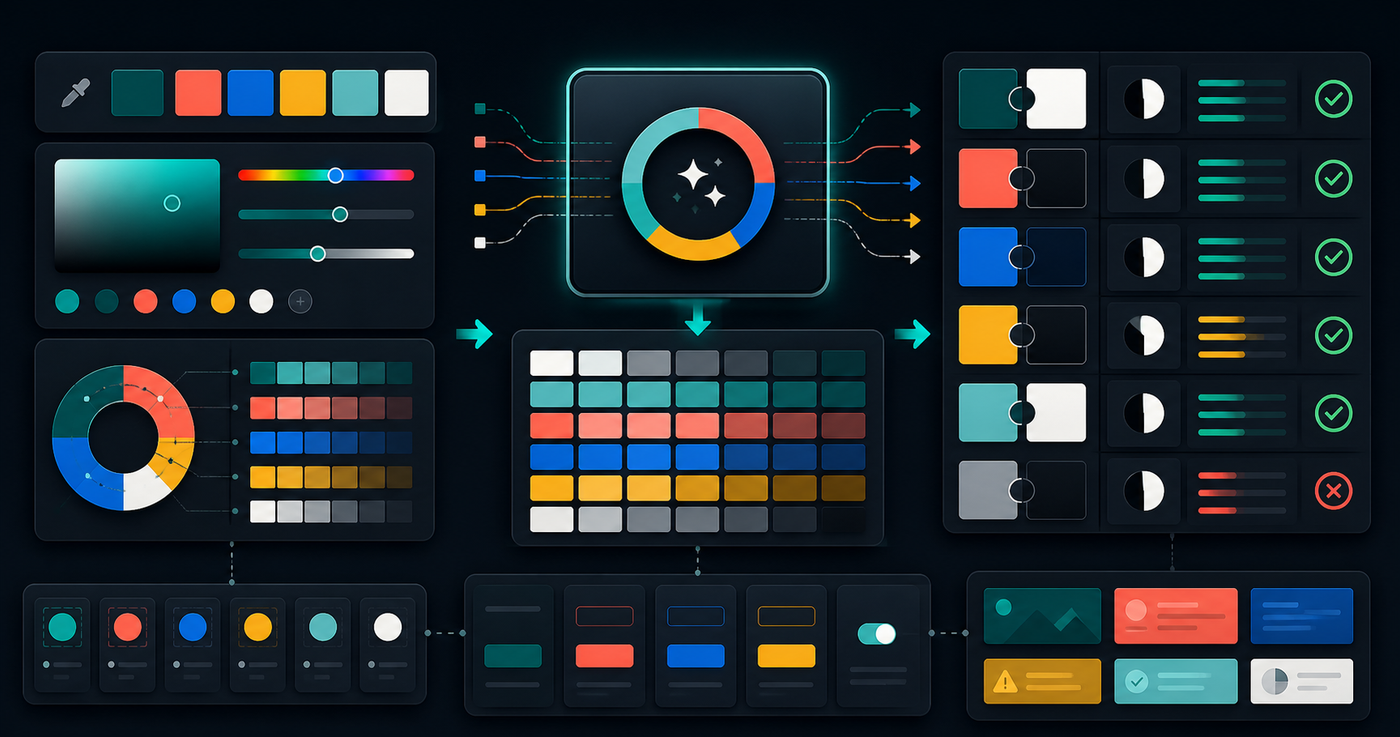
A palette can look good in a mockup and still fail in the product. Real interfaces need text, borders, controls, disabled states, charts, alerts, and hover states that stay readable across backgrounds.
Color work becomes easier when you treat the palette as a system instead of a row of nice swatches.
Start With Roles, Not Favorite Colors
Name the job each color performs. A brand color, page background, card surface, text color, muted label, focus ring, warning state, and destructive action all need different levels of contrast and attention.
- Define foreground and background pairs together.
- Reserve saturated colors for actions, states, or highlights.
- Keep body text and muted text readable before adding decorative colors.
- Check colors on the actual surfaces where they will appear.
- Avoid making success, warning, and error states depend on hue alone.
Check Contrast in Real UI Pairings
Contrast is not a property of one color. It is a relationship between two colors at a particular size and weight. A color that works for a large badge may fail for small helper text.
Test common combinations before shipping: body text on page background, muted text on cards, button text on filled buttons, links in paragraphs, focus rings near borders, and chart labels over colored areas.
Turn Decisions Into Tokens
Once the pairings work, capture them as tokens. Tokens keep the palette from drifting as components multiply and make dark mode easier to reason about.
:root {
  --color-bg: #080b09;
  --color-text: #f7f7f0;
  --color-muted: #9ca3a3;
  --color-accent: #21c7a8;
}
Use semantic names for product roles and raw color names for low-level primitives. That gives designers and engineers room to change a value without renaming every component.
The Palette Contrast Checklist
- Test foreground and background colors as pairs.
- Check body text, muted text, links, buttons, and form states.
- Verify focus, hover, disabled, success, warning, and error states.
- Test the palette in both light and dark contexts when both exist.
- Do not rely on hue alone to communicate status.
- Convert approved choices into reusable design tokens.
- Review the palette inside dense screens, not only hero sections.
Use a Palette Generator Before Editing CSS
Use the Color Palette Generator at /tools/color-palette-generator/ when you need to explore swatches, CSS variables, Tailwind-style scales, and contrast checks before changing production styles.
A usable palette is not just attractive. It is readable, repeatable, tokenized, and resilient enough to survive real product screens.
Related Posts

UUIDs: Pick Identifiers That Survive Real Systems
Use UUIDs deliberately: choose the right identifier shape, keep IDs opaque, avoid collisions, and test how values move through APIs and databases.
Password Generators: Create Strong Secrets Without Leaks
Generate passwords safely by choosing length, randomness, and storage habits before a secret ever leaves your browser.

Hash Checks: Verify Data Without Guessing
Use hashes to compare files and text safely: pick the right algorithm, preserve exact input bytes, and verify checksums before trusting data.